Sage Intacct UI Update – Action!
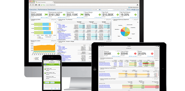
The Sage Intacct UI update made for a welcome addition to the 2018 R2 release. The focus of this update is all about simplicity and efficiency:
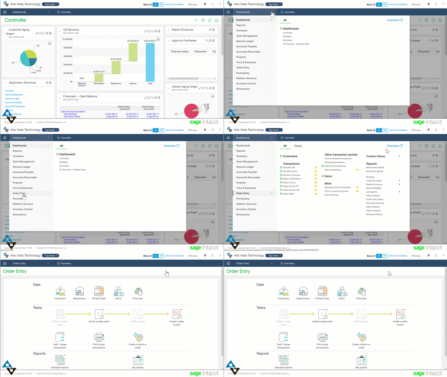
- Easy scanning and use is a priority, with all menus in one place
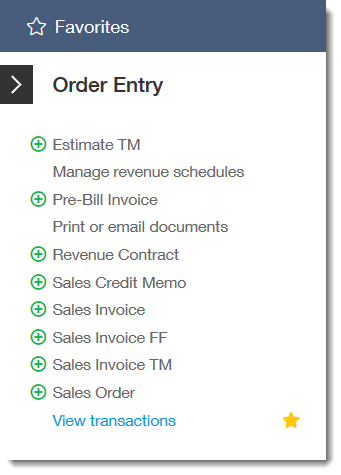
- Simplified favorites to get to those most commonly used screens
- Fewer steps to get to all features
- Overall, the improvements to attachments, dialog behavior, and more
The Intacct UI Update Benefits
The first comment we heard from our customers about the Sage Intacct UI—named the “Action UI“—was how great the favorites simplify workflow.
 By having a favorites menu easily accessible in one place users are able to jump to the handful of actions (Action! 😁) instead of having to navigate long menus trees. Users can star the things they do most, and remove the star for those selections no longer used.
The result of this small change to the navigation is that users are able to navigate using just their favorites window. If you have ever hear of the Pareto Principle (also known as the 80-20 rule) you can assume that users will spend 80% of their time on 20% of the options within the system.
If that’s true (and really, who are we to argue with Italian economists?) then users who tag their favorites can have a click or two to get to the screens they need to get their jobs done. We coach our customers to add favorites casually and remove them when they no longer serve a purpose or as a user’s job focus evolves over time. We recommend frequent changes much like a user can get more usage out of dashboards by changing them as needed.
A video showing all there is to know about the 2018 Release 2 of the Action UI is available here for still more information. Happy viewing!


